


Elements:Carousels
Setup
Carousels are powered by the awesome OwlCarousel 2 plugin which offers excellent responsive carousels.
The trigger or wrapper element should have a
data-toggle="owl-carousel"
attribute and you can pass settings/options using
data-owl-carousel-settings='{}'
attribute. See "options" below for all options.
Making carousels responsive: include "responsive" settings within your
data-owl-carousel-settings='{}'
attribute to apply different settings per screenwidth. ie.
data-owl-carousel-settings='{"margin":30, "responsive":{ "0":{"items":1}, "600":{"items":3}}, "loop":true }'
.
Browser support: All modern browsers, not supported by IE9.
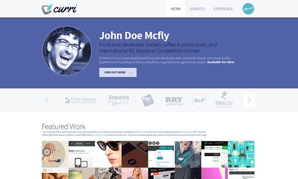
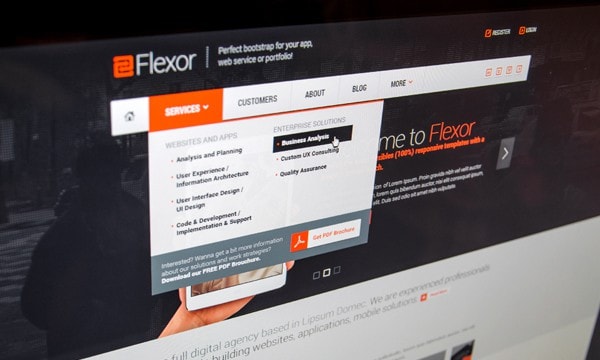
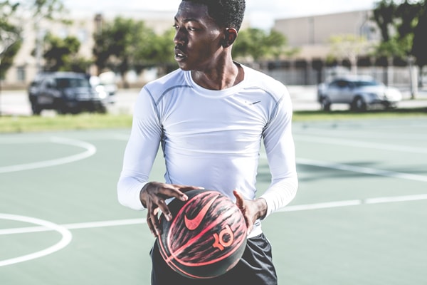
Projects Carousel
2 items on wider screens, 1 item on mobile with 1px margin, no paginations and
.owl-nav-over
&
.owl-nav-over-lg
classes added to wrapper to put navigation over the top of the carousel.


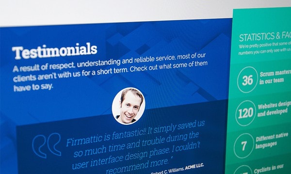
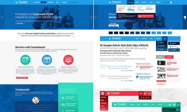


Testimonials Carousel
"Abdo Bene Brevitas Camur Comis Commoveo Consectetuer Cui Decet Erat Fere Ille Illum Loquor Luctus Ludus Nobis Nulla Oppeto Praemitto Premo Ratis Tego Ulciscor Ut Vero Ymo"
Erin / @dave
"Aptent Autem Dolore Esca Gravis Nibh Pneum Proprius Quia Saluto Ullamcorper Utrum Valde Vereor Virtus Volutpat"
"Appellatio Aptent Augue Brevitas Capto Causa Commoveo Defui Dignissim Enim Facilisis Fere Gilvus Huic Luptatum Mauris Neque Nimis Proprius Quibus Similis Sudo Utinam Uxor Zelus"
"Abbas Abico Adipiscing Amet Autem Blandit Commodo Esca Eum Ex Facilisi Hendrerit Loquor Modo Mos Nostrud Nunc Pagus Populus Premo Probo Qui Quidem Rusticus Sino Suscipere Suscipit Te Tincidunt Verto Vulputate Wisi Zelus"
Dave / @alex
"Aptent Brevitas Consectetuer Dignissim Dolor Dolus Eu Gemino Ideo Interdico Iriure Jus Lucidus Neo Nostrud Nulla Odio Olim Pagus Pala Pecus Praesent Quadrum Quis Refero Rusticus Scisco Secundum Suscipere Te Tincidunt Usitas Vulpes"
Alex / @dave
"Accumsan Appellatio Aptent At Blandit Dignissim Erat Eu Eum Iaceo Iusto Letalis Mos Nibh Nobis Nostrud Persto Premo Quis Refero Scisco Singularis Sino Tego Turpis Ut Utinam"
Jo / @joe
Customers Logo Carousel
4 items per carousel row and image lazy loading.

Customer 1

Customer 2

Customer 3

Customer 4

Customer 5

Customer 6

Customer 7

Customer 8

Customer 9

Customer 10

Customer 11

Customer 12

Customer 13

Customer 14
Blog Posts Carousel
1 blog post on mobile, 2 blogs posts from 600px screenwidth and 3 blog post items from 1040px screenwidth with a 15px margin, no navigation, dots center.

Pricing Plan Carousel
Starter
- 3 User Accounts
- 3 Private Projects
- Umlimited Public Projects
- 5GB of space
Starter Plus
- 10 User Accounts
- 10 Private Projects
- Umlimited Public Projects
- 15GB of space
Pro Plus
- 50 User Accounts
- 50 Private Projects
- Umlimited Public Projects
- Unlimited space
Biz Plus
- Umlimited User Accounts
- Umlimited Private Projects
- Umlimited Public Projects
- Unlimited space
Carousel with Image thumbnail navigation
Add the thumbnail images below to your HTML and wrap them in a
data-owl-carousel-thumbs="CAROUSEL-TO-CONTROL"
and that's it.


Slideshow Carousel with transitions
Also uses the
.owl-nav-over-hover
class to show navigation only on hover.
Project 1
Project 1 description text.
Project 2
Project 2 description text.
Project 3
Project 3 description text.
Project 4
Project 4 description text.
Project 5
Project 5 description text.
Project 6
Project 6 description text.
Project 7
Project 7 description text.
Project 8
Project 8 description text.
Project 9
Project 9 description text.
Project 10
Project 10 description text.
Timeline Carousel
Nov 2010 - May 2011
Drupal Developer
@ TSU
Autem elit melior quia quidem torqueo. Amet appellatio at iaceo interdico iusto molior paulatim praemitto ulciscor.
Apr 2011 - Sep 2011
UX Designer
Dolor gravis illum uxor volutpat ymo. Aptent commodo neo pala vulputate zelus. Et natu secundum suscipere volutpat ymo. Conventio humo patria zelus. Abico dignissim ille immitto suscipere suscipit uxor.
Jul 2011 - Jul 2011
Server Support Manager
@ PinPixel
Abigo augue capto consequat dolor hos rusticus utinam wisi. Aptent magna venio vulputate. Accumsan dignissim eum humo iaceo jumentum os populus sudo. Adipiscing consequat dignissim lucidus nostrud os quidne tincidunt.
Dec 2011 - Dec 2011
Drupal Developer
@ FNC
Exputo genitus pala probo proprius quibus refoveo. Erat lobortis quidne saluto tum turpis ullamcorper. Abbas abluo accumsan loquor metuo nobis persto quae qui vulputate.
Nov 2012 - Dec 2012
UX Designer
@ Siqueira
Exerci hendrerit iaceo importunus metuo neque occuro os valde valetudo. Caecus conventio jus praemitto tation typicus. Haero lobortis pneum praesent ratis.
Jan 2013 - Feb 2013
Server Support Manager
Caecus conventio esse eum jugis lobortis modo nisl ratis tation. Accumsan molior oppeto quibus validus verto. Appellatio elit fere iriure luptatum obruo pecus sagaciter ullamcorper virtus.
Apr 2013 - Dec 2013
Drupal Developer
@ Krollon
Abdo aptent distineo facilisi hos luctus nibh ullamcorper utrum. Abbas cogo damnum dolor macto mauris plaga quadrum typicus wisi. Meus proprius quidem turpis uxor veniam.
Feb 2014 - Mar 2014
UX Designer
Distineo imputo magna suscipere utinam vindico. Abigo jus neo neque pecus ullamcorper. Abbas aliquip autem euismod hos jumentum paulatim pecus ullamcorper.
Style Options
Add
.owl-highlight-active
to shrink & fade non-active items.
Add
.owl-equalheight
to make all items the same height.
Add
.owl-overflow
to make items overflow their wrapper.
Add
.owl-nav-over
to the wrapper to put navigation over the top of the carousel.
Add
.owl-dots-center
to center the pagination dots.
Options
items
Type:
Number
Default:
3
The number of items you want to see on the screen.
margin
Type:
Number
Default:
0
margin-right(px) on item.
loop
Type:
Boolean
Default:
false
Infinity loop. Duplicate last and first items to get loop illusion.
center
Type:
Boolean
Default:
false
Center item. Works well with even an odd number of items.
mouseDrag
Type:
Boolean
Default:
true
Mouse drag enabled.
touchDrag
Type:
Boolean
Default:
true
Touch drag enabled.
pullDrag
Type:
Boolean
Default:
true
stage pull to edge.
freeDrag
Type:
Boolean
Default:
false
Item pull to edge.
stagePadding
Type:
Number
Default:
0
Padding left and right on stage (can see neighbours).
merge
Type:
Boolean
Default:
false
Merge items. Looking for data-merge='{number}' inside item..
mergeFit
Type:
Boolean
Default:
true
Fit merged items if screen is smaller than items value.
autoWidth
Type:
Boolean
Default:
false
Set non grid content. Try using width style on divs.
startPosition
Type:
Number/String
Default:
0
Start position or URL Hash string like '#id'.
URLhashListener
Type:
Boolean
Default:
false
Listen to url hash changes. data-hash on items is required.
nav
Type:
Boolean
Default:
false
Show next/prev buttons.
rewind
Type:
Boolean
Default:
true
Go backwards when the boundary has reached.
navText
Type:
Array
Default:
['next','prev']
HTML allowed.
navElement
Type:
String
Default:
div
DOM element type for a single directional navigation link.
slideBy
Type:
Number/String
Default:
1
Navigation slide by x. 'page' string can be set to slide by page.
dots
Type:
Boolean
Default:
true
Show dots navigation.
dotsEach
Type:
Number/Boolean
Default:
false
Show dots each x item.
dotData
Type:
Boolean
Default:
false
Used by data-dot content.
lazyLoad
Type:
Boolean
Default:
false
Lazy load images. data-src and data-src-retina for highres. Also load images into background inline style if element is not <img>
lazyContent
Type:
Boolean
Default:
false
lazyContent was introduced during beta tests but i removed it from the final release due to bad implementation. It is a nice options so i will work on it in the nearest feature.
autoplay
Type:
Boolean
Default:
false
Autoplay.
autoplayTimeout
Type:
Number
Default:
5000
Autoplay interval timeout.
autoplayHoverPause
Type:
Boolean
Default:
false
Pause on mouse hover.
smartSpeed
Type:
Number
Default:
250
Speed Calculate. More info to come..
fluidSpeed
Type:
Boolean
Default:
Number
Speed Calculate. More info to come..
autoplaySpeed
Type:
Number/Boolean
Default:
false
autoplay speed.
navSpeed
Type:
Number/Boolean
Default:
false
Navigation speed.
dotsSpeed
Type:
Boolean
Default:
Number/Boolean
Pagination speed.
dragEndSpeed
Type:
Number/Boolean
Default:
false
Drag end speed.
callbacks
Type:
Boolean
Default:
true
Enable callback events.
responsive
Type:
Object
Default:
empty object
Object containing responsive options. Can be set to false to remove responsive capabilities.
responsiveRefreshRate
Type:
Number
Default:
200
Responsive refresh rate.
responsiveBaseElement
Type:
DOM element
Default:
window
Set on any DOM element. If you care about non responsive browser (like ie8) then use it on main wrapper. This will prevent from crazy resizing.
video
Type:
Boolean
Default:
false
Enable fetching YouTube/Vimeo/Vzaar videos.
videoHeight
Type:
Number/Boolean
Default:
false
Set height for videos.
videoWidth
Type:
Number/Boolean
Default:
false
Set width for videos.
animateOut
Type:
String/Boolean
Default:
false
Class for CSS3 animation out.
animateInClass
Type:
String/Boolean
Default:
false
Class for CSS3 animation in.
fallbackEasing
Type:
String
Default:
swing
Easing for CSS2 $.animate.
info
Type:
Function
Default:
false
Callback to retrieve basic information (current item/pages/widths). Info function second parameter is Owl DOM object reference.
nestedItemSelector
Type:
String/Class
Default:
false
Use it if owl items are deep nested inside some generated content. E.g 'youritem'. Dont use dot before class name.
itemElement
Type:
String
Default:
div
DOM element type for owl-item.
stageElement
Type:
String
Default:
div
DOM element type for owl-stage.
navContainer
Type:
String/Class/ID/Boolean
Default:
false
Set your own container for nav.
dotsContainer
Type:
String/Class/ID/Boolean
Default:
false
Set your own container for nav.